Let’s face it, we are all super busy or time poor (take your pick). We are told that the best way to stay on top of your bills is to keep track of your usage, negotiate rates or switch providers. This practice could save you hundreds of dollars if done properly. Sounds simple right?
Ok, let’s be honest, it’s harder than it sounds. I have tried it a few times myself and it can be tedious. The problem; electricity plans and rate schedules are not much fun to read. You need to know your consumption, your daily supply charge, your per unit (kWh) rate etc. Most importantly, the only source of data you have is the quarterly or monthly bill which puts you at the mercy of your electricity provider.
My little project: Electricity consumption data monitoring
I knew that I had a smart meter at my premises which must spit out some kind of data. Following this hunch I went on to my electricity provider’s website and then onto the wholesale supplier for my region @Jemena. That is when I stumbled across this:

Digging a littler deeper, I registered and got access to my portal. That is when I learnt, that Jemena allows customers to download their raw energy usage data as a .csv (comma separated values) file. I went on and downloaded my file to see what information was included. See below:
That is when my eyes light up. “I can work with that I thought to myself!”
What information would I want to see?
I started to think about the kind of information I would like to see so I could get a good idea about my electricity usage patterns and spending at a glance.
This is what I came up with:
- Average daily usage over a period of time
- Average Daily spend
- Estimate Spending (past and current)
- Total Usage over a period time.
- Usage Pattern broken down into Peak, off-peak and total usage.
- Historic data for the past year from today showing total usage by month and average daily usage for those months.
Turning raw data into goodness:
Armed with the raw data and some basic @Splunk skills, I went to work on it.
I won’t bore you with detailed search queries, field selection and how I built the dashboard. For those interested, I plan to write a second post with detailed step-by-step instructions (coming soon – part 2).
It took some tweaking but started to come together bit by bit. To check off my list of requirements I came up with the following panels:
✔ Daily Average Usage:
✔ Daily Average Spend:
✔ Estimate Spend:
✔ Total Usage:
✔ Usage Pattern: Total usage, Peak usage, Off-peak usage:
✔ Historic Data for past year: by month and average daily usage
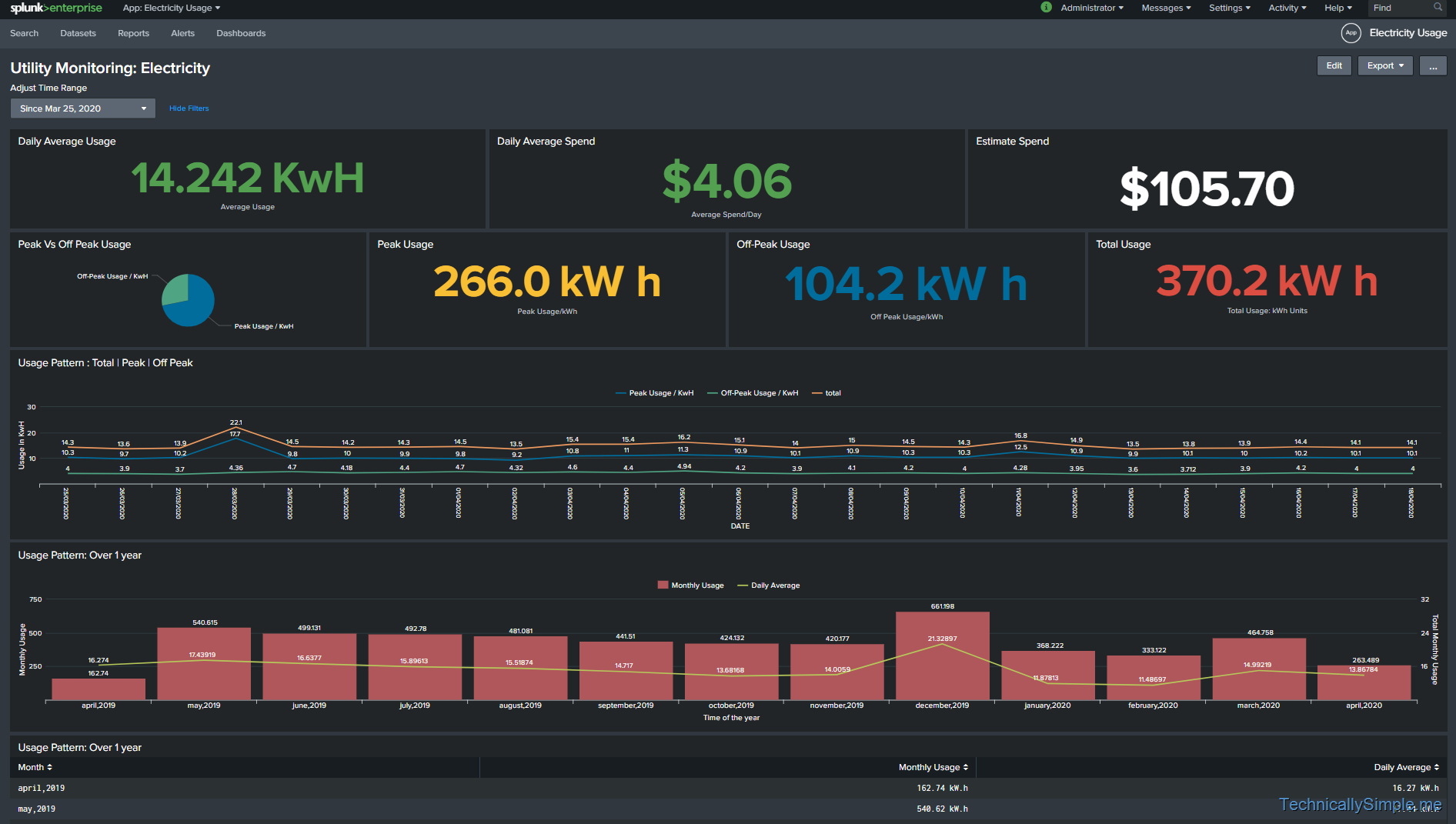
Putting it all together in a single pane (at a glance) view, this is what I came up with.
✔ Finished Utility Monitoring: Electricity dashboard
Conclusion:
Through this little project I wanted to share with you the importance and power of data. We create, use and spread raw data in everything we do. It’s only a matter of applying the right lens before the magic starts to unfold right in front of your eyes.
Very interesting article Madhul. Thanks for sharing.